We’ve all been there. You search for a site or item on google and you find a link to a website. you click on that link and what unfolds in front of your eyes is a complete monstrosity. You will instantly click it off and that website has lost a customer. There’s lots of reasons people will click away from your website. Here are a some reasons why:
Auto Playing Music
You know what im talking about. You can be sitting in a busy office and browsing onto a website then all of a sudden you are hit with a wall of sound from a 1980’s computer game. Just awful. I can totally understand that some sites such as musicians etc would need music on their site but you have to give people the option to play it or not. Forcing music on people is one of the biggest turn offs in web design.
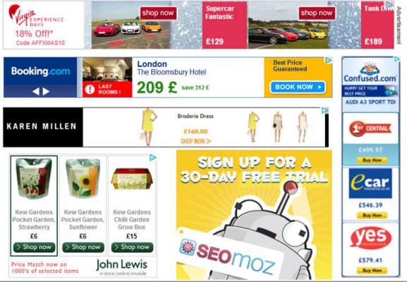
Adverts Everywhere

We all understand that you have to bring attention to your products but having adverts everywhere on your site is not always conductive to securing a sale. Even worse is 3rd party adverts all over the page. I find these very unprofessional and downright annoying.
Complicated Navigation
If a customer is on your site and cant find what they are looking for in a few clicks then chances are they will look elsewhere. Have your menu’s and page structures clearly laid out with everything in its logical place. The easier you can make it for customers the better their experience of your website will be.
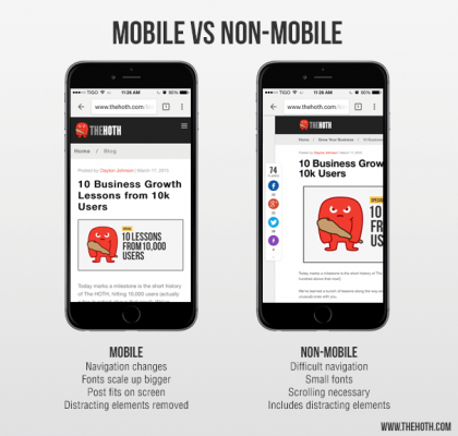
Unresponsive Website

Nowadays you simply have to have a mobile version of your site. A high number of people will access your website via their phones. If your website looks rubbish and doesn’t function correctly on phones then you will lose customers. To have a responsive website it must be able to adapt to whichever device it is being displayed on. Websites never look the same on PC’s as they do on mobile phones – mainly because its a different size of screen and web browser. This is absolutely crucial in modern web design. All our websites come with complete responsiveness – we test them on multiple devices to make sure they look and work right.
Outdated Content
If you land on a website and you notice it hasn’t been updated in months (sometimes years) then chances are you will lose a bit of faith in it. If the company running the website cant be bothered to keep it up to date then are they really going to come through with your order?
Badly Written Content
You want your company to look its best when presented online. having bad spelling and lazy, short content isn’t going to keep customers reading. You want to engage them, give them relevant information and give the image that you are professional and that you care about their experience visiting your website.
Slow Loading Speeds
How slow is ‘slow’ these days? If you wait 10 seconds and above then you will probably click the website off and another customer is driven away. Normally this is due to bad web hosting, bad design or the website trying to deliver large, unnecessary file sizes. We regularly check this and measure speeds on all our sites. E.g. www.digiayemedia.co.uk should fully load in under 1 second (pretty fast right?). We make sure all images are resized and optimized for the web. There’s no point in delivering a high quality picture at 10mb when a 100kb picture will look the same on screen.
Pop Up Windows
Do I need to explain this one? They are very irritating. Please, no.
No Social Media Links
If you aren’t on Social media these days, why not? We totally understand that Facebook and twitter aren’t for everyone on a personal level. However for driving business to your website they are now absolutely crucial. A lot of potential customers will check out your facebook page first as they feel comfortable using it – its also a great and easy way for them to contact you. You can keep these pages updated yourself and engage your customers directly on their mobile phones.
Using Stock Images
We know every business has to start somewhere and its not always easy to have high quality images of your business and products. However try and stay away from using stock images. You may find that the popular ones show up on other websites and people will recognise this. It looks lazy and unprofessional. There is nothing to stop you adding personal photos of your staff, premises and products – even from a camera phone. At least you will be unique. We cant play down the efefcts of having your won personal professional photography on your site though, it does look great. We can offer professional photography as part of your package.
Ugly Landing Pages
First impressions are not to be overlooked. Having a good looking site and a professional looking landing page will impress your customers. It will keep them engaged and help promote trust in your brand. Now imagine you landed on something like this: http://www.lingscars.com/ – where do you even begin to look for what you came for? (my eyes are bleeding!!!! maybe she will hypnotise me into leasing a car?)
Ensure You Give People What They Came For
You need to make sure your website does what you say it will. You cant have anything irrelevant on screen. you need to put yourself in the shoes of your customers and think about what they want to see. If you have told them they will see informations about ‘product A’ then thats what you have to deliver. If they see anything thats irrelevant and in their way then it will drive them away.


Pingback: New Website Launch - MechAir Engineering - Web design Glasgow