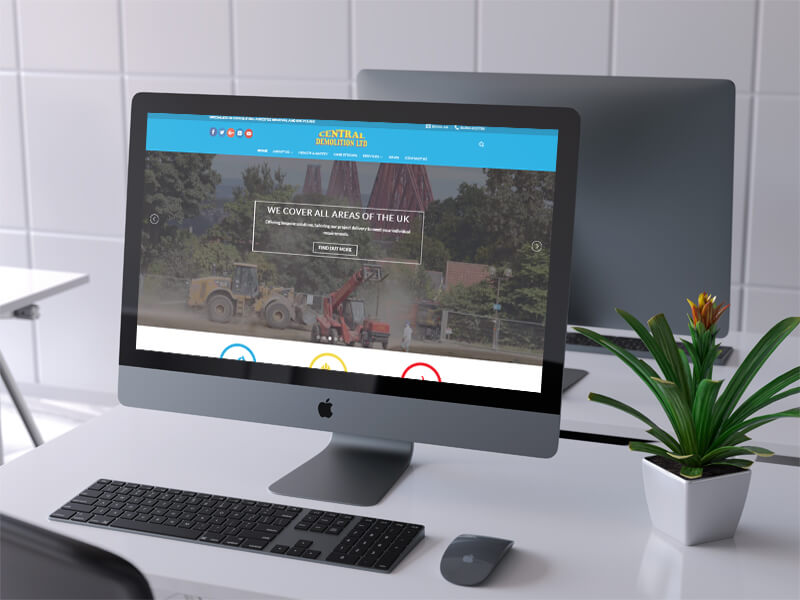
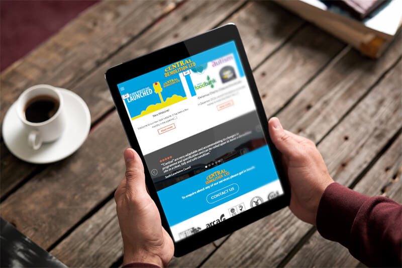
We were approached by Central Demolition to give their website a wee bit of a digital facelift. Their original site had fantastic content on it but everyone felt it could be presented in a more efficient and attractive way and to make it easier for their customers to find the information they needed.
You can see the old site below.
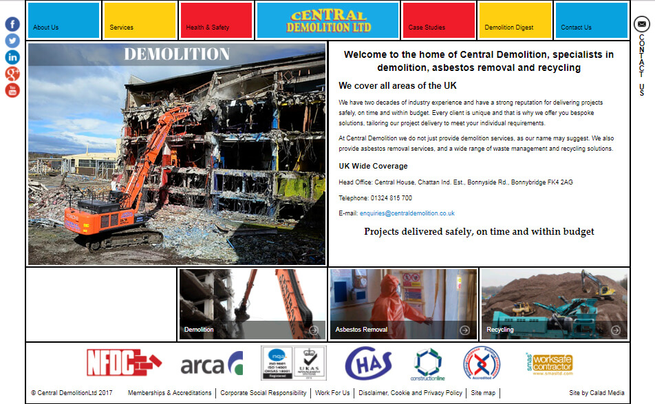
We wanted to spread this information out and structure it better. We have detailed what you can see on the homepage below. It should be instantly apparent that we have expanded the page – which is the first thing the customer sees to clear sections with a focus on having the customer get in touch with the company.
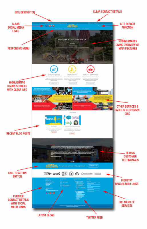
We have made the site responsive so that it changes shape depending on what device you view on. So really we have built 3 sites – 1 for desktop computers, 1 for tablet viewing and 1 for mobile handsets. It was more work but we wouldn’t have it any other way – most users now view on their mobile phone and it has to work for them.
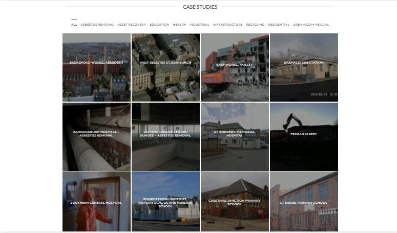
Another part of the site we like to show off is the ‘Case Studies‘ section. The company has completely a lot of previous work they wish to showcase to prospective clients. On the old site this was hard to navigate to. This is now very clear and easy to see with a wealth of information on show with an interactive gallery that can be filtered depending on the subject.
Overall this was a great project to work on. Central Demolition had put a lot of work into collating information together to present to their customers and we are glad we could make this shine for them.


